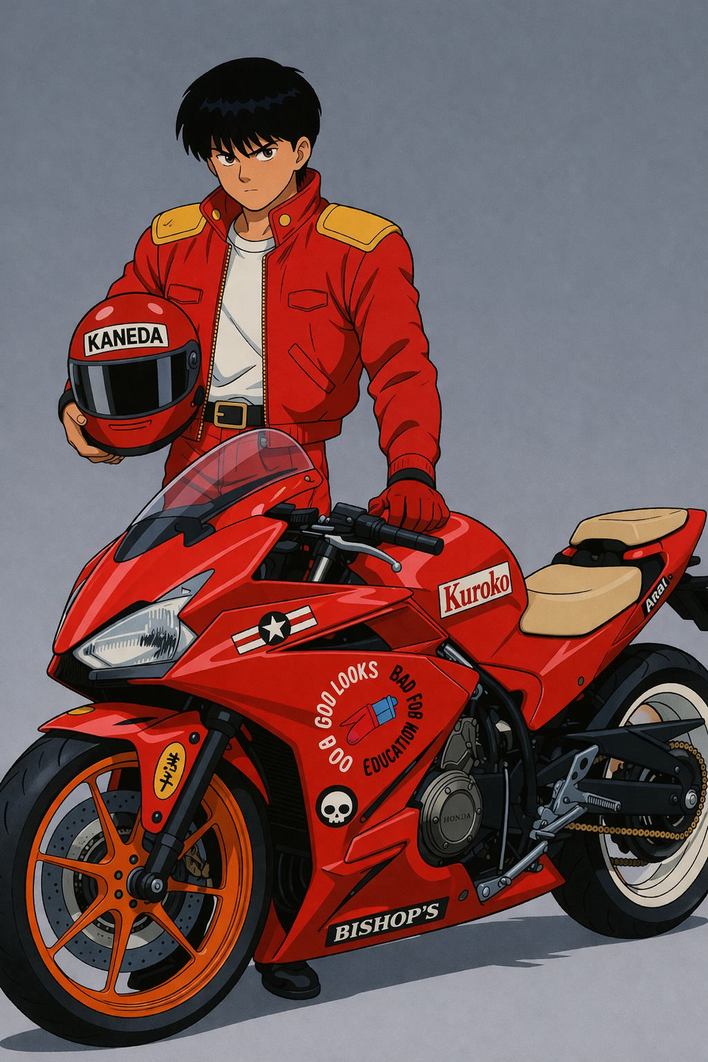
KUROKO // AKIRA TRIBUTE BUILD
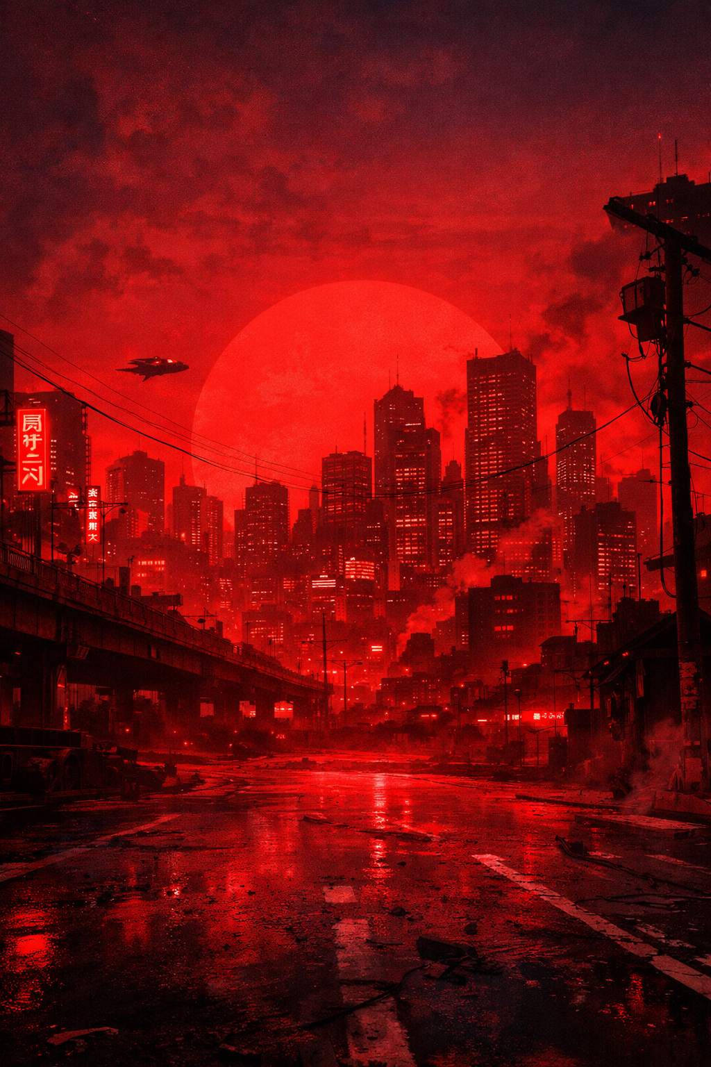
Kuroko Tribute Bike on display at FACT, Liverpool, from 17–24 April
to mark the Akira 4K re-release






Not Just Wrapped.
Built.
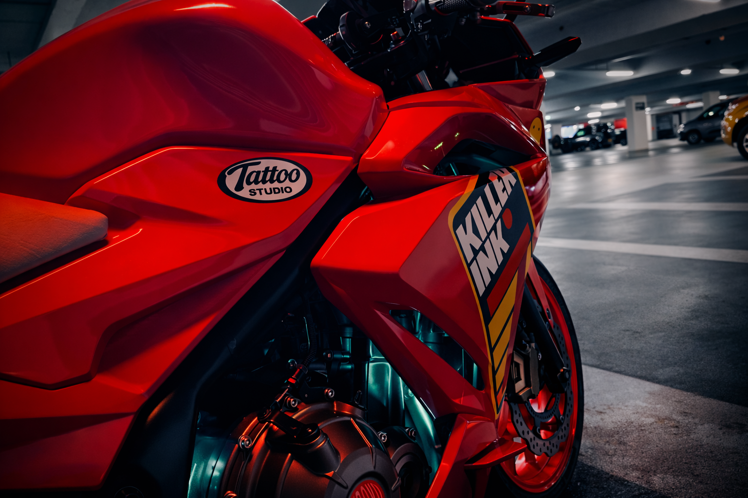
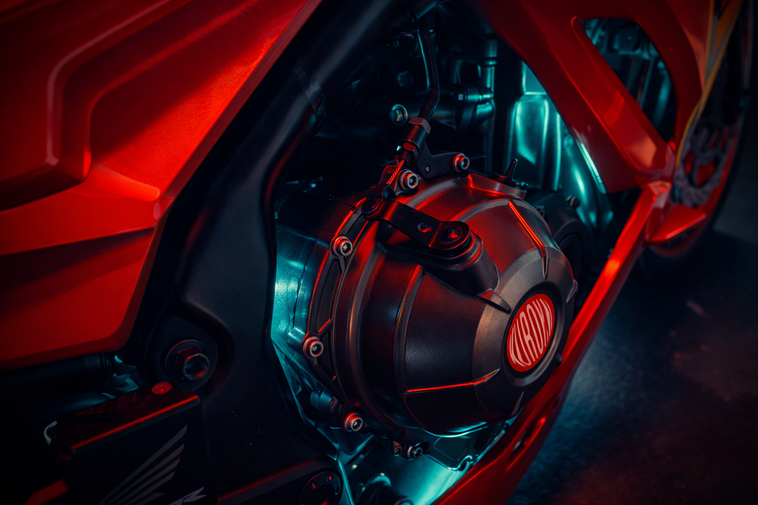
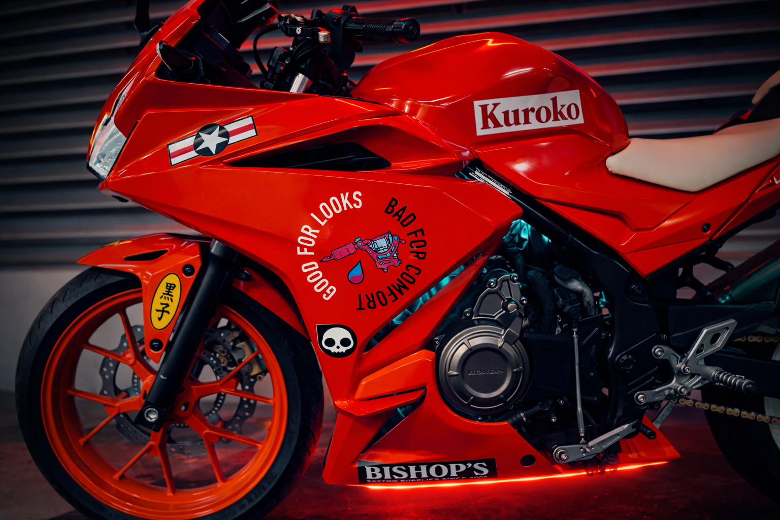
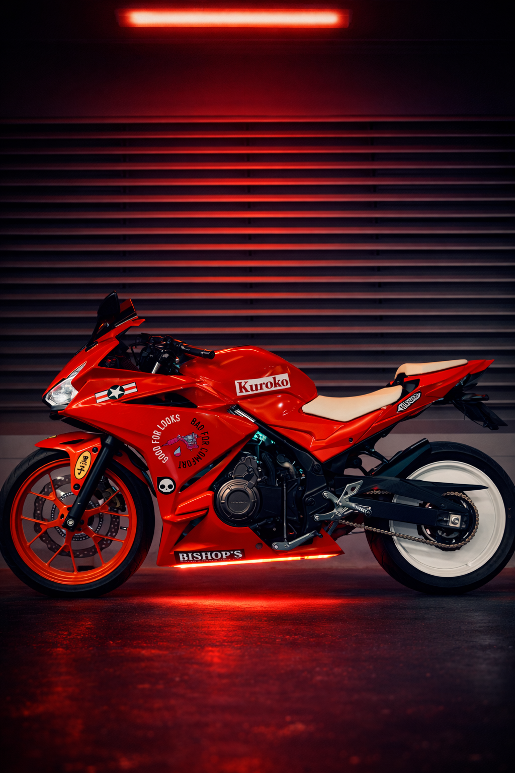
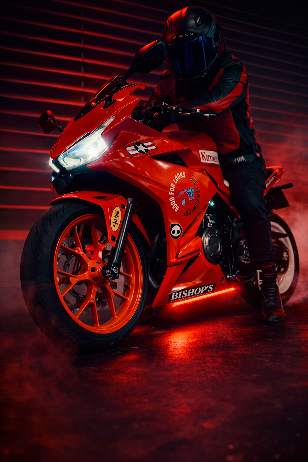
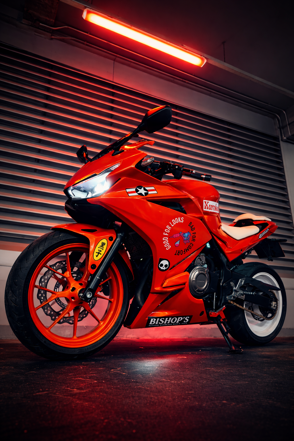
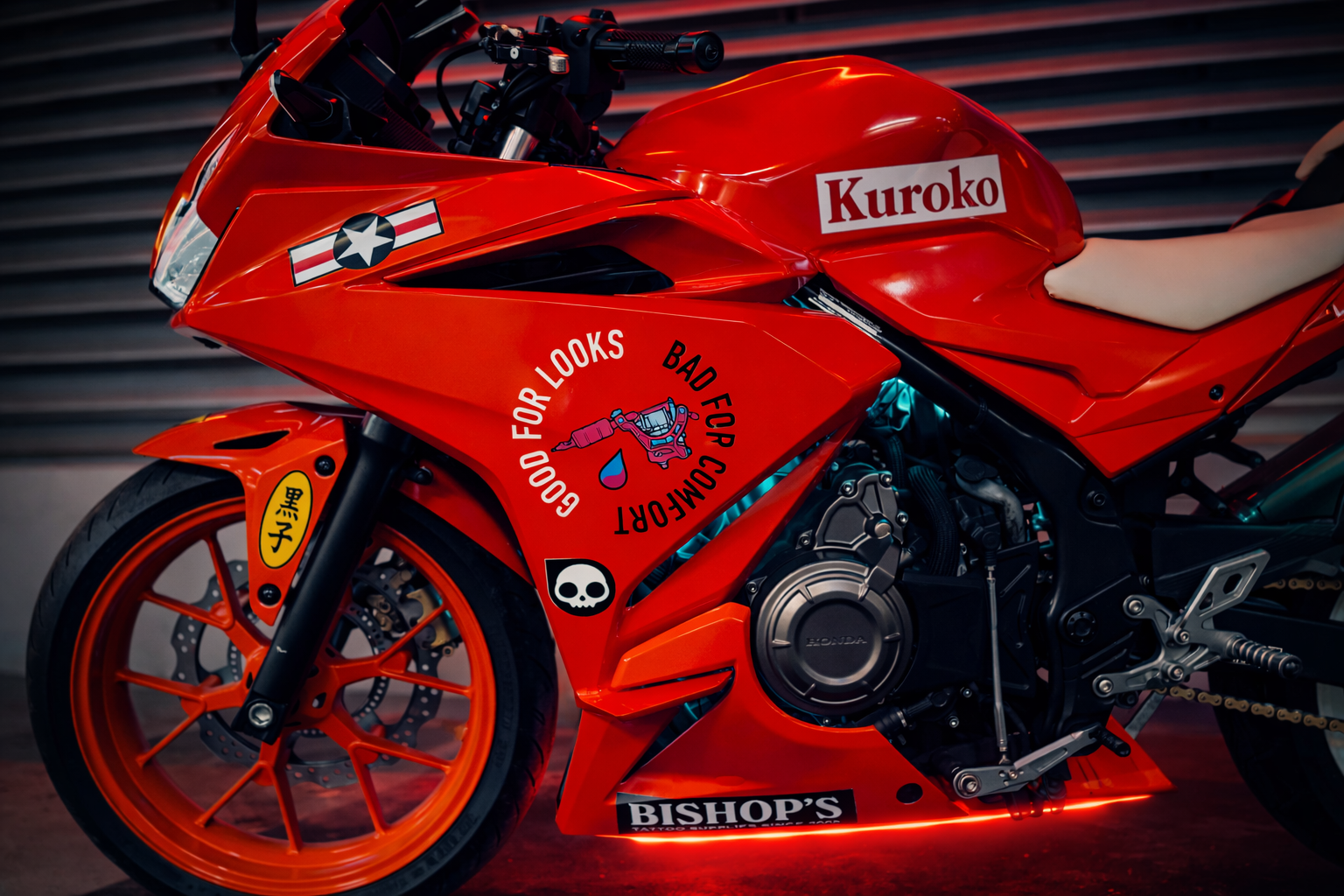
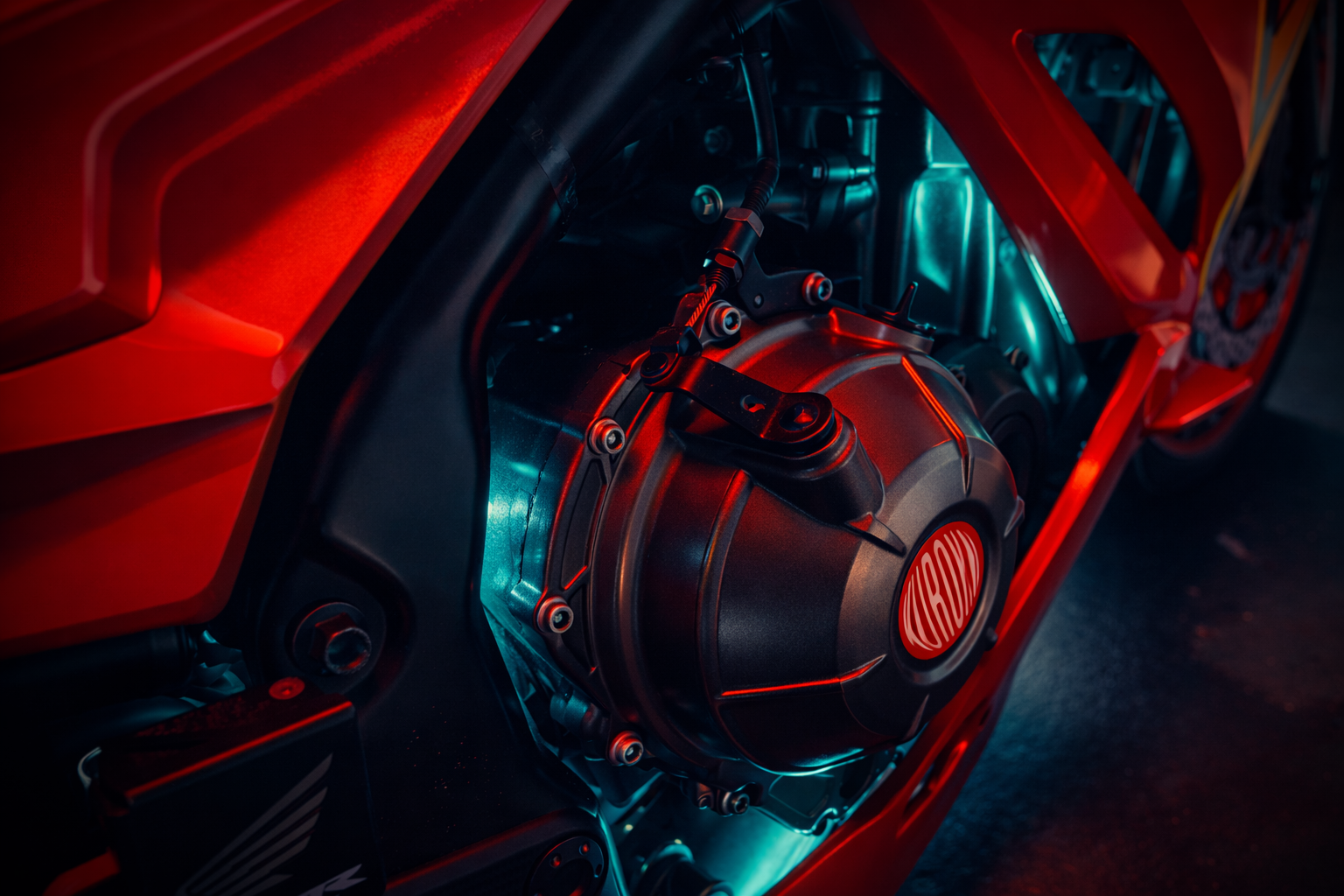
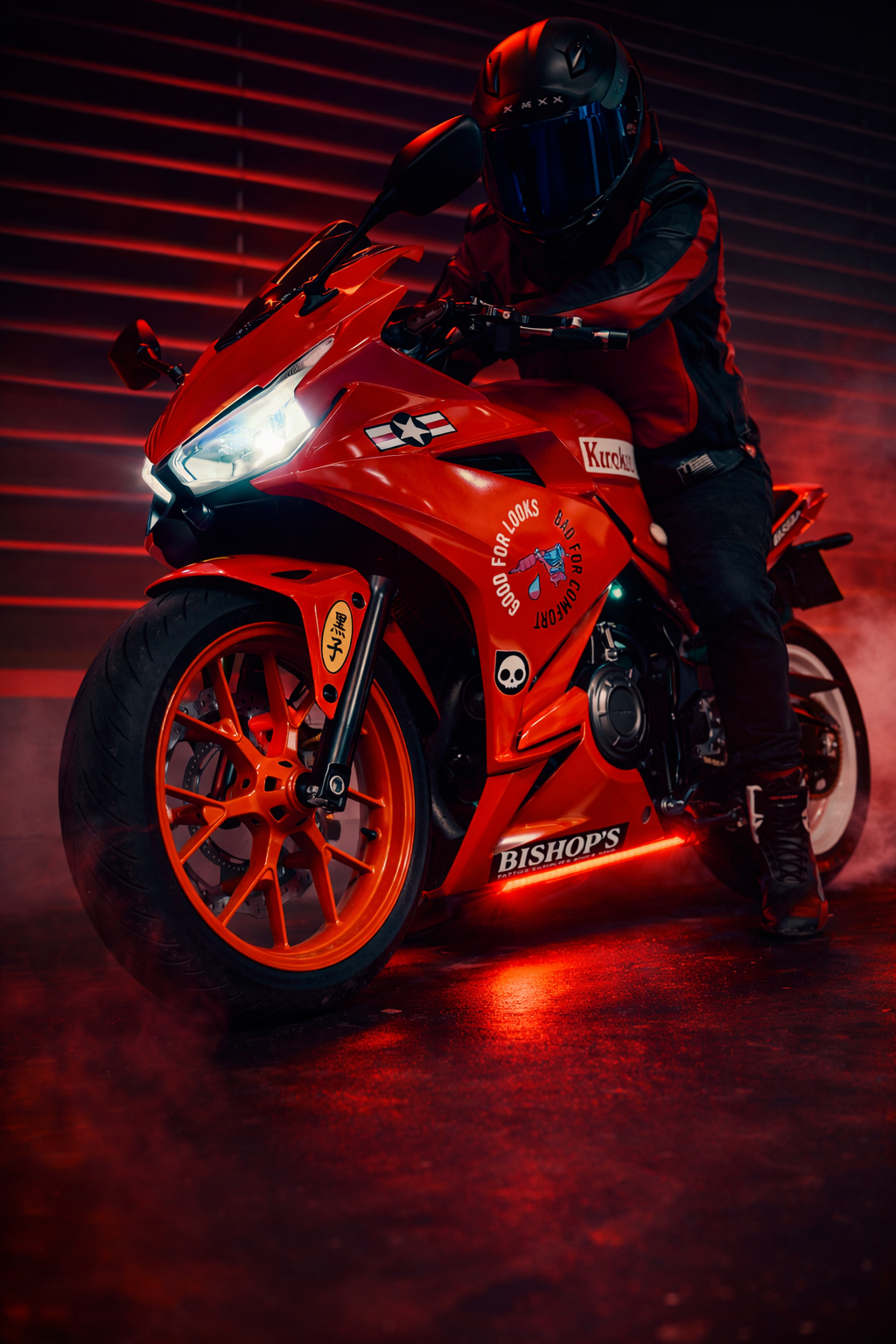
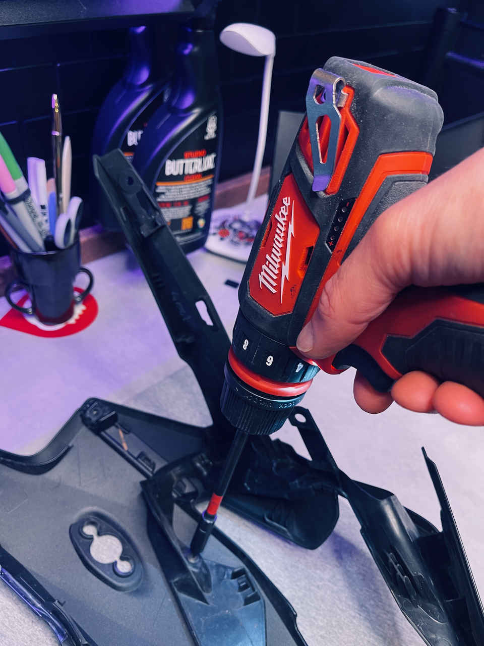
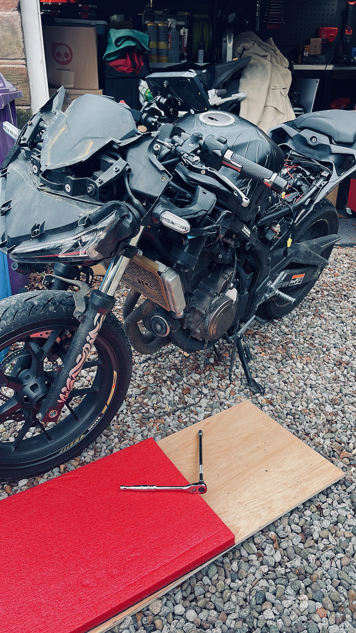
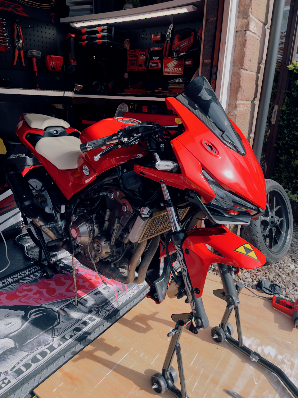
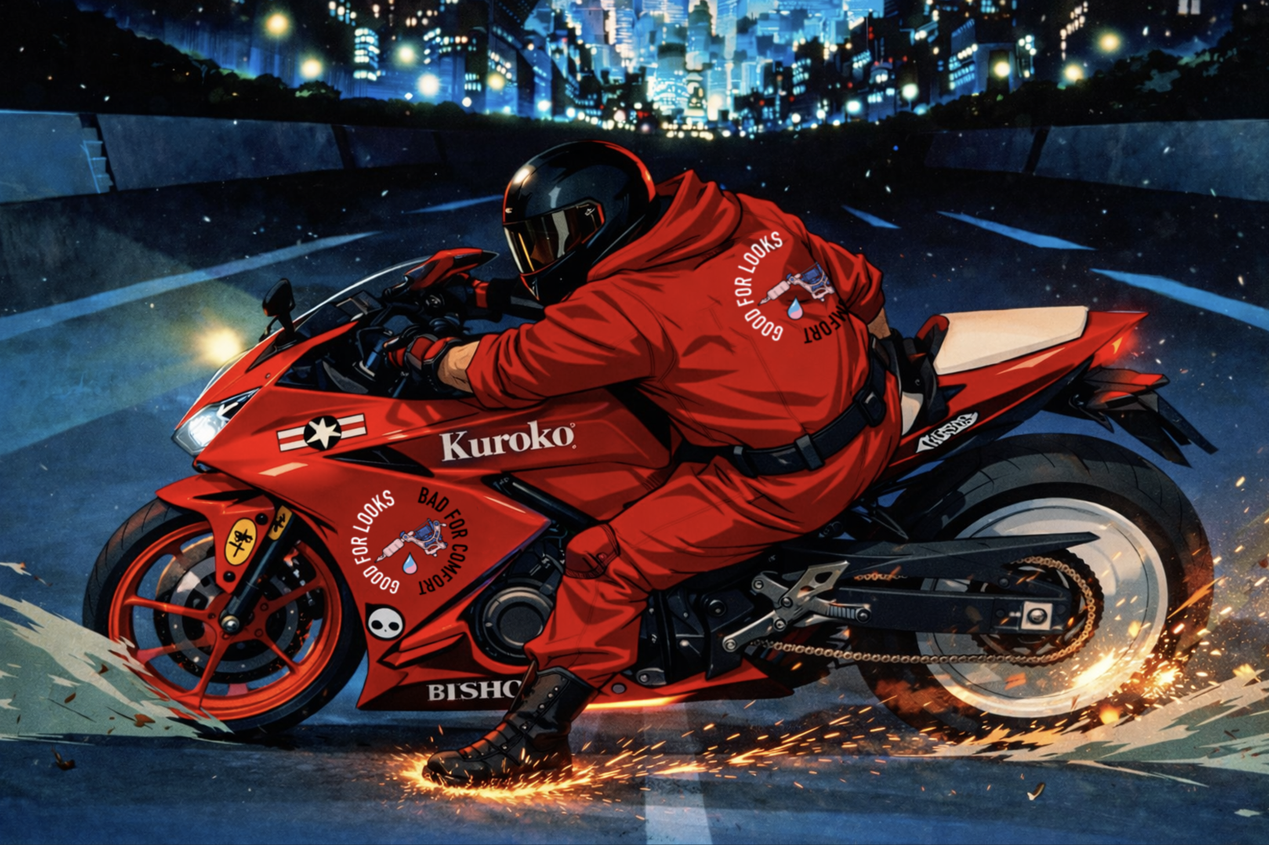
This piece was designed to feel visually excessive. I wanted saturation, tension and high colour. By removing bonded plastic parts and wrapping additional components, I pushed the bike beyond a standard finish and closer to something more graphic, artificial and robotic.
The red was chosen with intention. Rather than using a neutral modern red, I leaned towards a warmer, more orange-based tone that feels closer to the reds found in traditional irezumi.
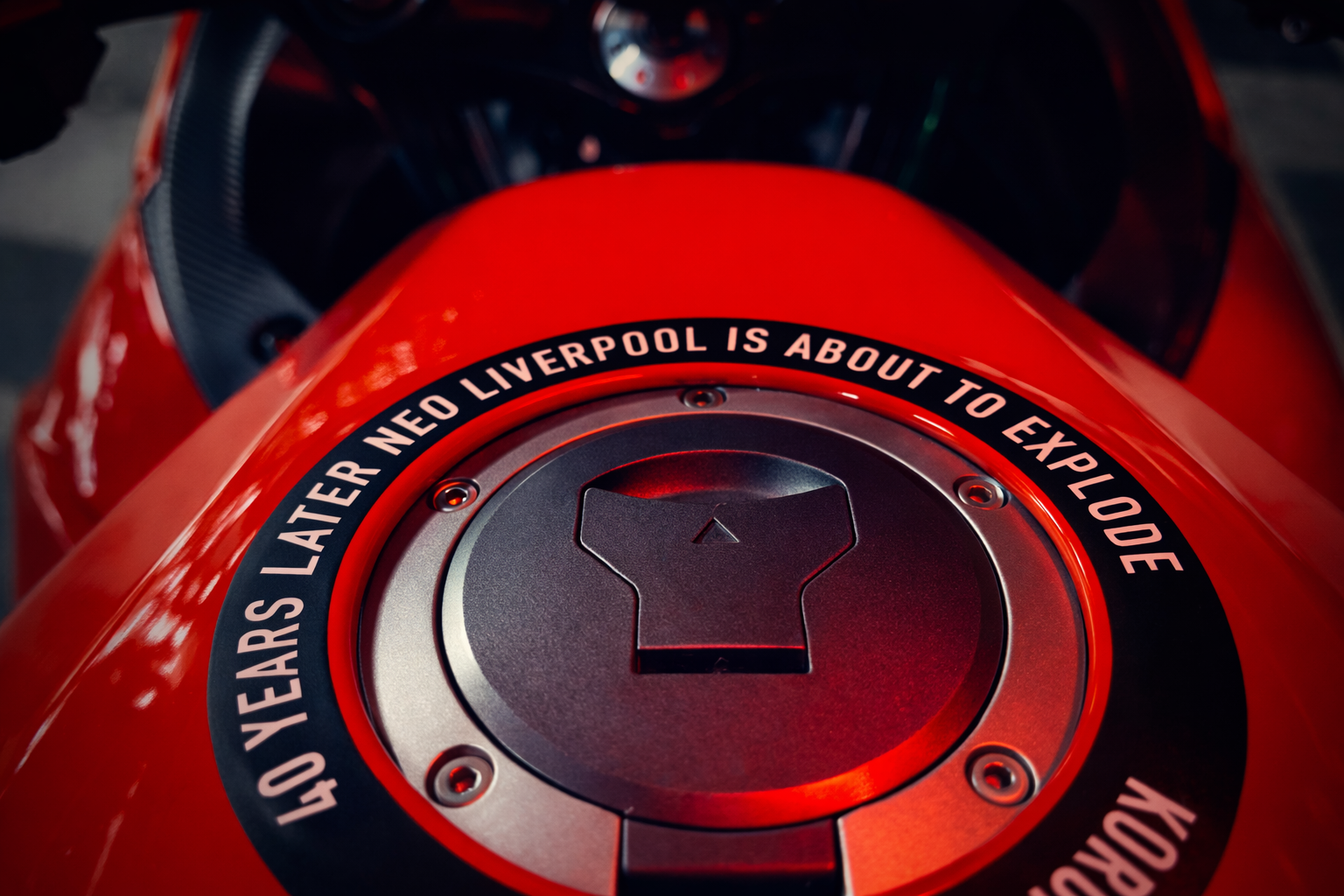
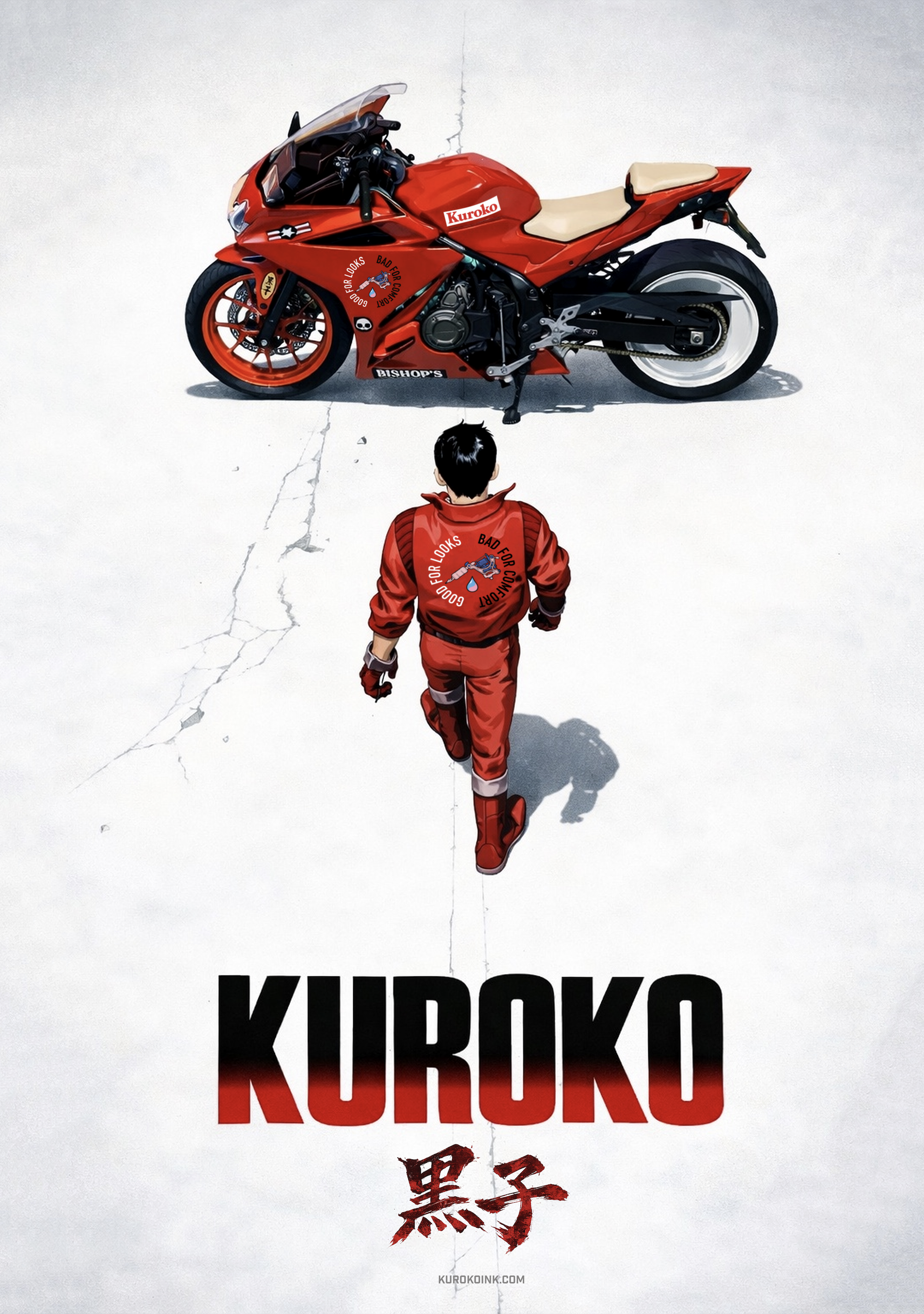
40 years later Neo Liverpool is about to explode
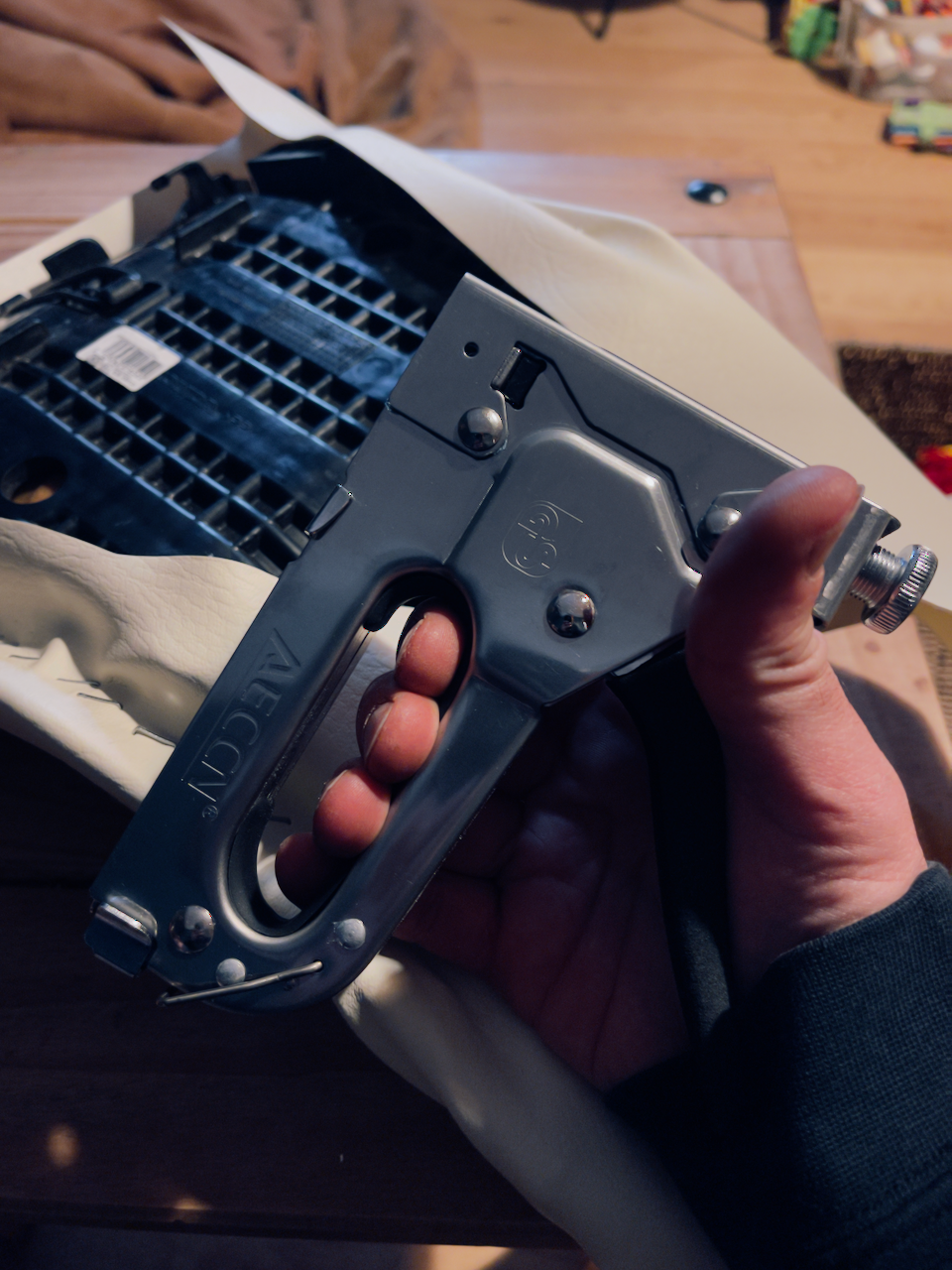
I upholstered the seat by hand, choosing a colour that feels deliberately impractical. That contrast mattered. I wanted something unconventional — a decision that makes the bike feel less obedient to standard motorcycle design and more like an authored piece.
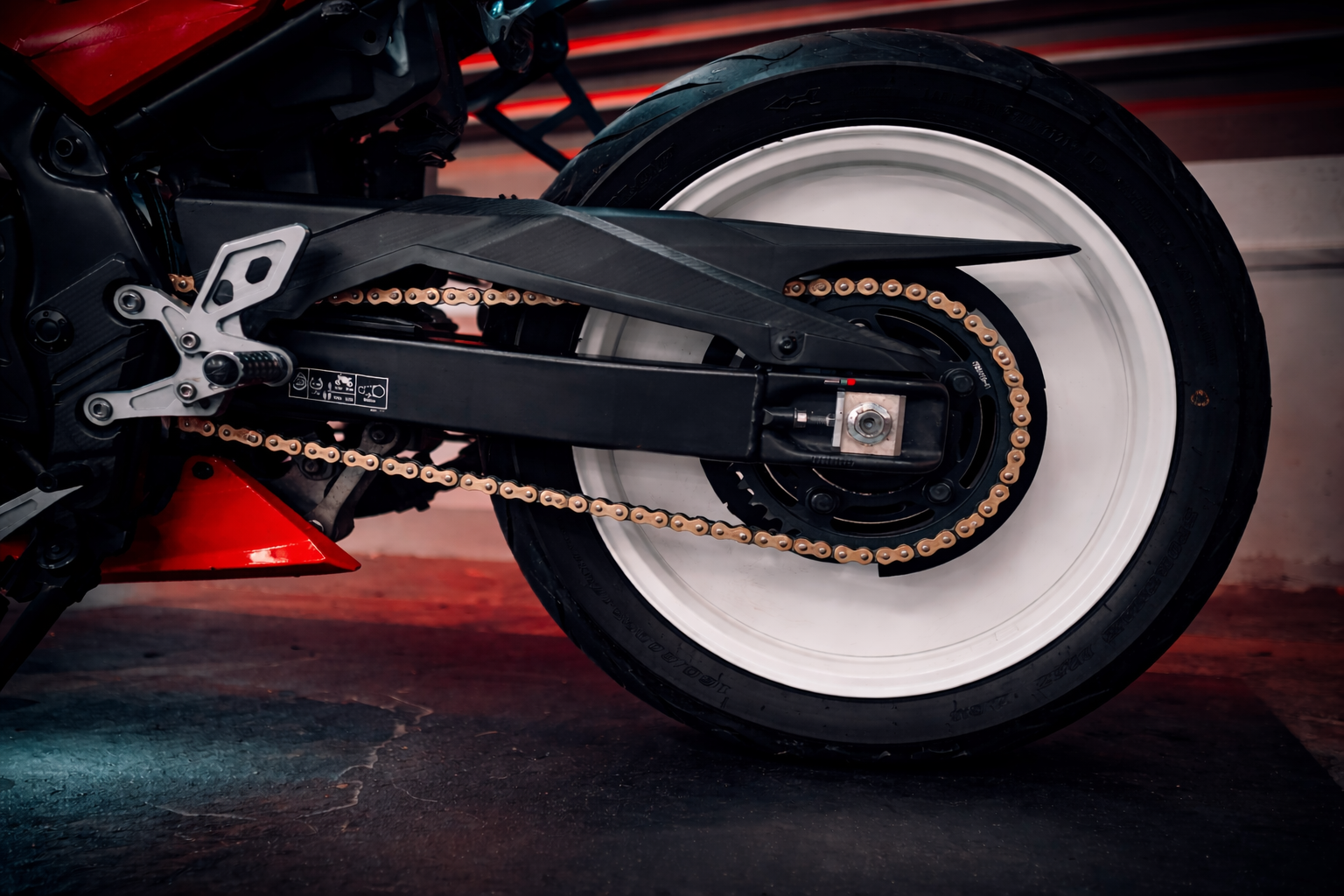
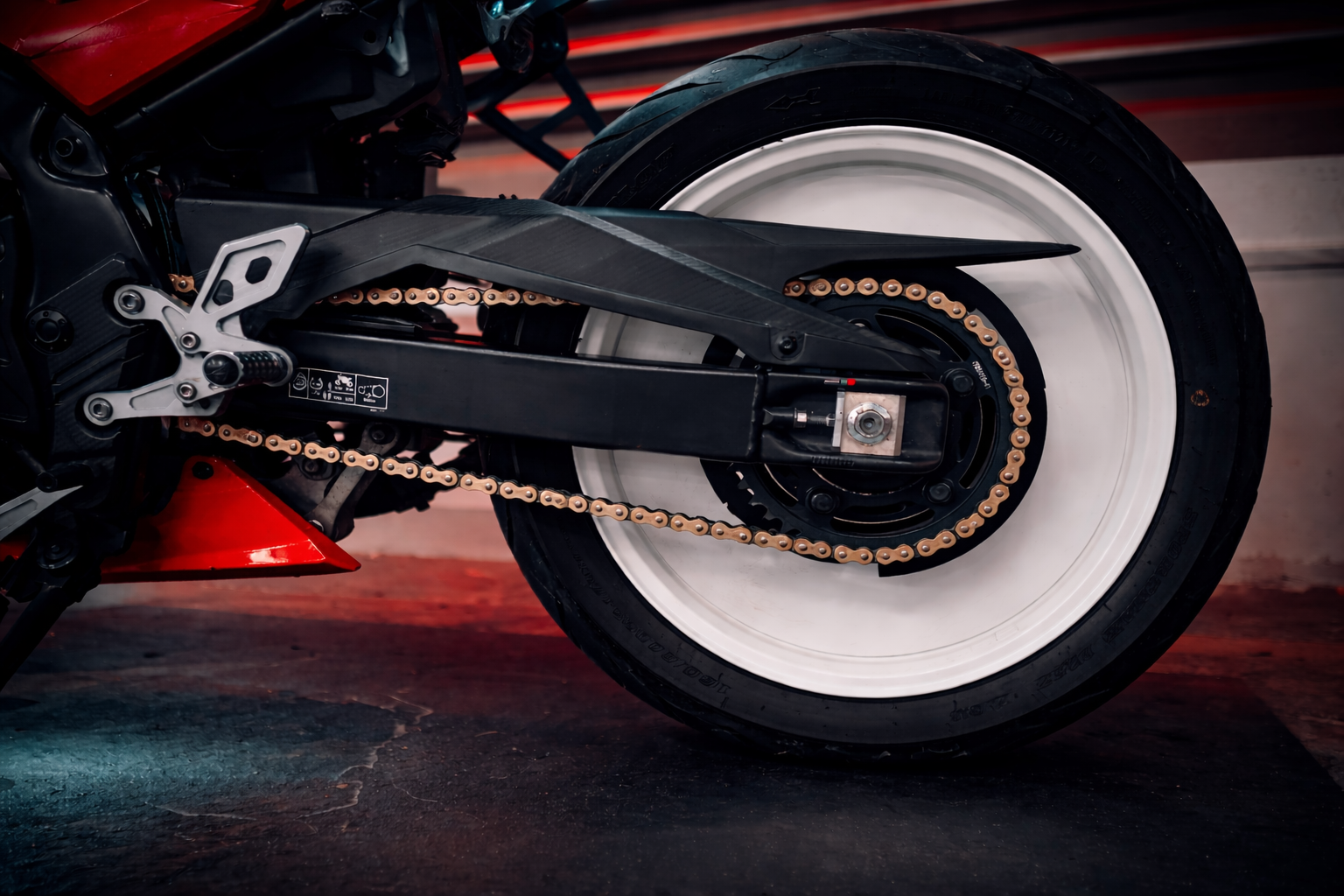
At the rear, I fabricated a solid wheel treatment inspired by the visual weight of Kaneda’s bike. It creates a heavier mass and a more cinematic silhouette, bringing in a slightly dystopian, post-apocalyptic feel.
The graphics themselves were designed and made by hand on my kitchen table. That DIY process is central to the work: tactile, obsessive, local and built through detail.